Google has recently rolled out a significant update to its Phone app, bringing a fresh design and new features to one of the most widely used Android apps. The update has introduced a full visual refresh and functional tweaks, including the integration of Material 3 Expressive Design and the new Calling Cards feature. These changes have stirred up conversations across various platforms, especially on Reddit, where users are actively discussing their opinions about the revamped Google dialer.

What’s New in the Google Dialer Update?
The redesigned Google dialer brings several notable changes, both visual and functional. Here’s a breakdown of the key updates that have caught the attention of users:
1. Material 3 Expressive Design
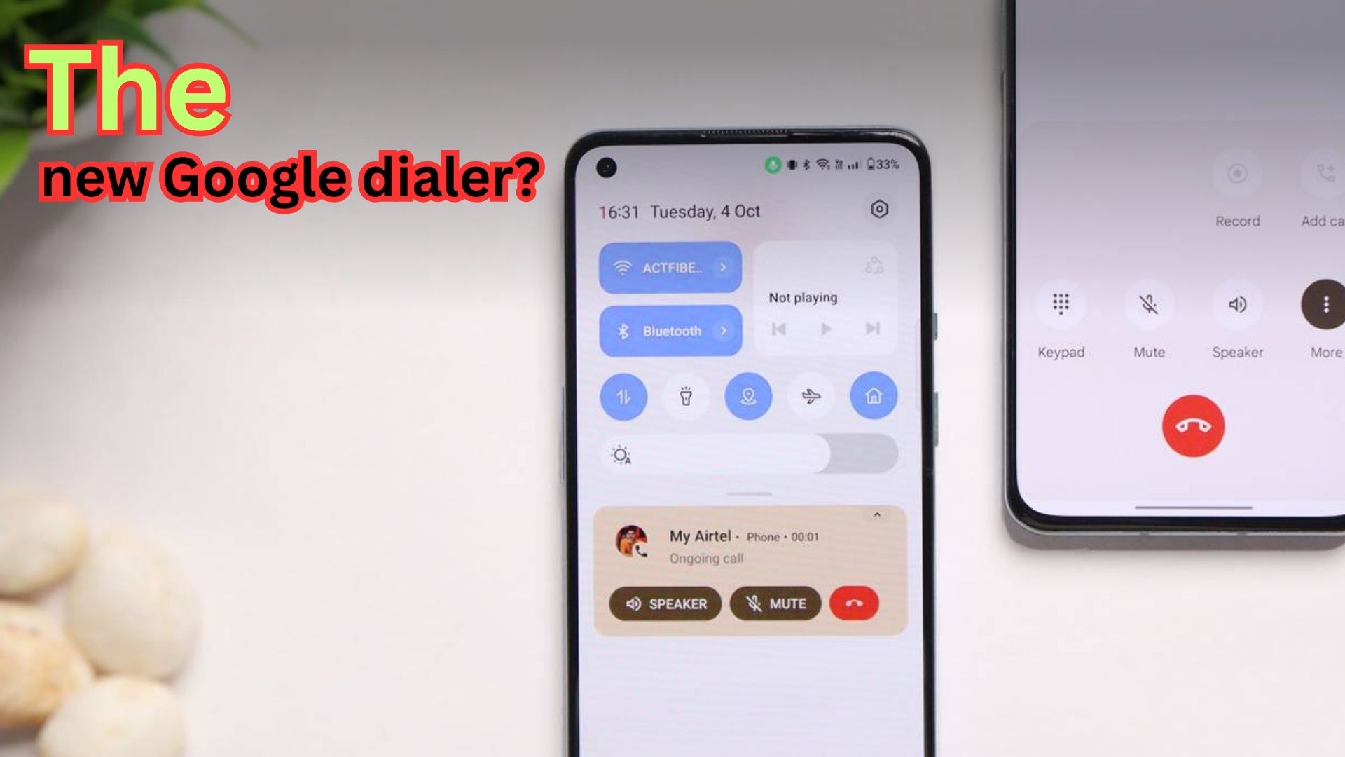
The most immediate change that stands out is the switch to Material 3, which provides a more expressive and dynamic look. The app now features larger buttons, a bolder color scheme, and more consistent visual elements throughout the interface. The goal of this redesign is to create a more modern and aesthetically pleasing user experience. Many users have expressed their appreciation for the new look, citing how it feels fresh and sleek compared to the previous version of the app.
2. Calling Cards: Full-Screen Contact Photos
One of the most popular new features is Calling Cards, which replaces the traditional circular thumbnail with full-screen contact photos. This is a major visual change, as the new design allows for larger images and stylized text, offering a more personalized feel when receiving a call. The calling experience now feels more modern, much like Apple’s Contact Posters, making the user interface more engaging and visually appealing. This feature has garnered praise for making incoming calls look more dynamic.
3. Larger Touch Targets
To improve usability, Google has introduced larger touch targets, which are particularly useful for people with larger fingers or those who need more accessibility options. This design choice makes interacting with the app easier and more intuitive, although some users feel that it takes up more screen space than necessary.
4. Simplified Navigation with a Few Controversies
The update also simplifies some aspects of the dialer navigation. However, it’s not all smooth sailing. One of the biggest complaints is about the new swipe-right gesture for answering calls, which replaces the old swipe-up gesture. This change has disrupted years of muscle memory for long-time users of the app, leading to confusion and frustration.
Another issue is the addition of certain features, such as the hold button, which has now been moved behind a three-dot menu. Some users have expressed dissatisfaction with this change, as it makes accessing key features less straightforward.
5. Performance Issues and Lag
While the design has gotten a major facelift, there have been complaints regarding performance. Some users have reported lag when tapping buttons like the speakerphone toggle, which can be frustrating during calls. This issue seems to be affecting certain devices more than others, but it’s worth noting as a potential downside of the new update.
Summary
Feature |
Description |
|---|---|
Redesign |
The Google dialer has been refreshed with Material 3 Expressive Design, providing larger buttons and a bolder visual aesthetic. |
Calling Cards |
Full-screen contact photos replace the traditional thumbnail, offering a personalized calling experience. |
Touch Targets |
Larger touch targets have been introduced for improved usability, especially for those with larger fingers. |
Swipe Gesture Change |
The swipe-to-answer gesture has been changed from swipe-up to swipe-right, which has confused some long-time users. |
Performance Issues |
Some users have experienced lag when using features like the speakerphone toggle. |
Navigation Changes |
Key features like the “hold” button are now hidden behind a three-dot menu, making navigation more complicated for some users. |
User Reactions: Praise and Complaints
As with any redesign, reactions have been mixed. The new Google dialer has certainly garnered attention, but opinions vary on whether the changes are for the better.
Positive Reactions
Many users have embraced the new design, appreciating the larger buttons and full-screen contact photos. The Calling Cards feature, in particular, has been singled out as a standout addition, allowing the app to feel more modern and visually engaging. Some users have even gone as far as to say that the update makes the experience of receiving calls feel personal and dynamic, unlike the more static nature of previous versions.
Negative Feedback
On the other hand, some users have expressed frustration with the new design, especially regarding navigation issues and performance glitches. The swiping changes and the buried hold option have created confusion for some users, who preferred the older interface. Additionally, some users have criticized the overall look of the redesign, calling it wasteful or overdone, arguing that it compromises usability for the sake of visual flair.
Is the Google Dialer Redesign Worth It?
So, is the new Google dialer a smart upgrade or a step in the wrong direction? The answer largely depends on personal preference. For those who prioritize a modern, personalized calling experience and appreciate the bold design changes, the update is likely a win. The full-screen contact photos and Material 3 design add a fresh touch that brings the app into line with other modern mobile interfaces.
However, for users who value simplicity and performance, the redesign might feel like a step backward. The added lag and changes to navigation, especially the swiping gestures, can be disruptive and frustrating.
In conclusion, the new Google dialer strikes a balance between aesthetics and functionality, but it doesn’t come without its issues. If you’re open to change and like the idea of a more visually dynamic interface, you’ll likely enjoy the update. But if you prefer the old, straightforward approach, this new version might take some getting used to.
FAQ
1. What is the Google dialer redesign?
A. The Google dialer redesign is a major update to the Phone app that introduces a new visual aesthetic with Material 3 design, along with new features like Calling Cards for full-screen contact photos.
2. How does Calling Cards work?
A. Calling Cards replace the small circular contact thumbnail with a full-screen image and stylized text, offering a more personalized call experience.
3. Is the new Google dialer update available for all Android users?
A. The update is being rolled out gradually and should be available to most Android users. However, the timeline may vary depending on your device and region.
4. Are there any performance issues with the new Google dialer?
A. Some users have reported lag, especially when using features like the speakerphone button. This issue might be device-specific.
5. Why did Google change the swipe gesture for answering calls?
A. Google switched from a swipe-up to a swipe-right gesture to streamline the interface. However, this change has been met with some frustration from users who are used to the old swipe-up method.
For More Information Click HERE